Monday, January 31, 2011

a quotable quote.

I have a challenge for you.

consider it an early bird's early bird challenge..
we have our february crop coming up this weekend,
so i have a challenge for you to think about.

my challenge for you this week is to use a quote
as the main focus of your layout!


my quote just happens to be mine.
my grade 2 teacher recently told my mom about
this little gem of a quote i had
to stand up and tell the whole class about.
love it!!!

...but your quote can be anyones...
what quotes inspire you???
i'd love to see what you come up with...
share it in the gallery!!

see you this weekend!!
Jen

Friday, January 28, 2011

Winter Sketch #5

For this week's sketch, I chose Pencil Lines #209:


And here's what I made with it, using Pink Paislee Queen Bee products & American Crafts thickers, from the Shoppe:


If you'd like to play along with my Winter Sketches, just create a layout using one of the sketches I post. Post your layout in the MSS gallery and then link it to this thread in the forum. Your name will be entered into a draw to win a RAK from me.

Have a great weekend!

Thursday, January 27, 2011

my go-to scrap supplies.

for today's post, i thought i would tell you what my favourite and go-to scrap supplies are. although, if i'm honest, these poor guys haven't gotten much action lately.

1. scotch quick dry adhesive
yes, i know there are tape runners and other such adhesives out there, but for some reason i can't part with my glue. i'm sure in 10 years all my photos will have fallen off, but i love this stuff. it has a fine tip, which is great for small items (beat that, tape runner!) and i feel like it lasts me forever. oh wait, maybe that's because i never scrap?

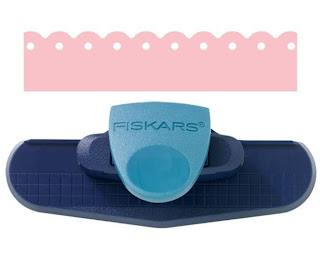
2. fiskars threading water punch
i was hesitant about buying this punch at first, but it's now become such a staple, i can't imagine living without it!
3. black, fine point zig pen.
i'm very, very particular about my pens. and so far, i'm loving this one! the tip is fine and it writes great.
4. mist, and more mist.
i was slow to jump on the mist bandwagon, thinking it would be a fad that would die over time. well, that never happened. so i reluctantly bought one. and it's changed my world. mists add that great little something to every layout, without being too much. the only drawback is your inability to control it, but in a way, that's what i love about it too. two faves are studio calico calico white mister huey and maya road sunflower yellow.

5. alphas.
i have a few alphas that i could use over and over again for certain things. for instance, these sassafras glitter alphas are definitely a fave. i love the colours, the size, the font....everything!
and for cards, i love these two alphas by making memories. they're the perfect size and add just the right amount of sparkle. the pink one is more fuschia and is glittered as well.

6. kraft cardstock.
i'm sure this is no surprise to you. kraft is definitely a go-to item for me. the only thing is that i bought a pack of kraft when i was in edmonton last year and it was different than the kraft you normally see. problem is, i can't remember what brand it was and i haven't seen it anywhere since. so now that beloved shade sits in my basket untouched, until i can find some more.
7. coredinations stormy gray cardstock.
next to kraft, charcoal is definitely a fave cardstock colour. and the new coredinations cardstock is fabulous. it's a great shade of gray and has amazing texture.
8. shipping tags.
blame it on lisa, but i can't get enough of shipping tags. i need to use them on every single layout! i buy mine in packs of 100 at staples for only $3 or so.
9. twine.
i usually top my shipping tags off with baker's twine. there was a bunch in the shoppe at one point, but they're all sold out now. i've also bought martha stewart twine at michaels, but it only comes out during christmas.
10. hp everyday photo paper.
lastly, since i print my pictures at home, i've found hp everyday photo paper works well. i tried various types of photo paper, and found this to be the best for my printer. it comes in semi-gloss and matte at staples, and this time around i picked up matte. i'm not sure if i love it or not....it really feels like lighter cardstock, compared to the semi-gloss.
so tell me - what are YOUR go-to scrap supplies?

Monday, January 24, 2011

using your stash....

So last night i decided that i wanted
to make something using some of my
favourite "things" that i tend to
hoard for "later"...i know you know
what i'm talking about. that perfect
rubon that doesn't have a home, or
that piece of flair that is just to
pretty to close up in a scrapbook..

So this is what i created.
it all started with the owl in the middle,
i just love it and have been saving it
for something, but have had it awhile...


from there i just went thru my bits and
pieces looking for the things i've been
hoarding, like the rainbow and deer rubons,
the cute buttons...and i only used scraps
for the patterned paper.
some squares are pop-dotted, others not.
i'm not sure if you can see it, but i started
by sewing a grid on the paper.

I plan on hanging this somewhere in my scrap
space, so i can look at it. it was really fun
to do this little project. i feel like i can
now use some of those items i've been "saving".

if you've been inspired to do the same, please
share!!! post it in the gallery so we can all
see!!! i'd love to see what some of YOUR fave.
things are!!!

later!!
Jen

Friday, January 21, 2011

Winter Sketch #4

This week's sketch is an April sketch from Page Maps:


And here's the layout I made using it:


I stuck pretty close to the sketch this time, except for adapting it to fit a 12x12 layout. I used Pink Paislee Queen Bee products, from the Shoppe.

If you'd like to play along with my Winter Sketches, just create a layout using one of the sketches I post. Post your layout in the MSS gallery and then link it to this thread in the forum. Your name will be entered into a draw to win a RAK from me.

Enjoy your weekend!

Thursday, January 20, 2011

quiet book tutorial.

as mentioned here, at my workplace, we do a gift exchange for christmas. the catch is that the gift has to be either handmade, or locally made. it's a very long story as to why i only finished my gift this week, but it's finished.

my original idea was actually to make an alphabet book, but when i purchased this mme chipboard, i realized not all the letters were represented. so instead, i decided just to do another quiet book. after playing with it for awhile, i just decided to do a remake of the quiet book shown here since i had a lot of the supplies still, and because i always loved that first book.

supplies used:
- album: 5x7 (can't remember what brand, though)
- cardstock: coredinations
- pp: american crafts, we r memory keepers, the girls paperie, cosmo cricket 1, cosmo cricket 2, echo park
- rubons: american crafts ned jr
- alphas: various sassafras glitter alphas
- chipboard: my mind's eye alphabet soup boy + sassafras bungle jungle
- punch: fiskars threading water
- zoo label: october afternoon cardstock sticker
- other: velcro, cropadile, 1.5" binder rings

i adhered almost all of the chipboard using velcro, so that each piece could be taken off and played with. i made sure to adhere the 'softer' side of the velcro to the backside of each piece, so that it wouldn't scratch.
definitely my favourite page of the book - the zoo page. to make the cage, i cut a 5" x 3" piece of the echo park paper. i then cut a 6" x 3.5" piece of cardstock to back it. the cardstock should line up flush with the top of the pp, be 1/2" wider on either side and the bottom. cut the bottom corners at an angle. adhere the two pieces together and cut out the cage "bars" using an exacto knife. mine were 1/4" wide and started 1/2" from each side. make sure you don't cut the cardstock that hangs over! take the pieces that hang over and fold them underneath, essentially making a pocket for the animals, like shown below:
i wanted a counting page in this book, but unlike my original book i didn't want to make a button slide. instead, the mme chipboard had multiples of some pieces so i decided to use those to have the children count to 3.

my coworker has a little boy, so i thought it would be cute to have a page where he could drive up and down roads with the little car and bike. originally, i just drew the roads but they were lacking something and ended up looking like gray hills instead of roads. that's when i remembered i had this cosmo cricket paper and thought the lines would help define them as roads.
again, in the original book, i also had a spelling section, but because their names were a lot longer, i didn't have enough space. instead, i thought having them actually print their name would work just as well. this cosmo cricket paper worked great for this, having the same type of pattern like on printing paper in elementary school.

i love the idea of giving an interactive, fun children's books as gifts to new mamas, and hope that this book is loved and well used by the kids!

Tuesday, January 18, 2011

Another sale

From now until Monday, January 24th....

take 30% off your total purchase.
(Excludes trimmers, adhesive and cardstock)

*Members receive an additional 10% off.

Friday, January 14, 2011

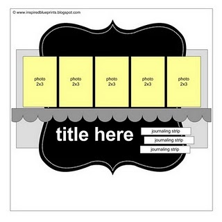
Winter Sketch #3

This week's sketch is Sketch #57 from Inspired Blueprints:


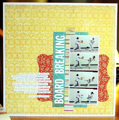
And here's the layout I made using it:


As you can see, I rotated the sketch and took out a photo. I also made everything in general smaller to allow for more white space on my layout.

If you'd like to play along with my Winter Sketches, just create a layout using one of the sketches I post. Post your layout in the MSS gallery and then link it to this thread in the forum. Your name will be entered into a draw to win a RAK from me.

Have a great weekend!

Monday, January 10, 2011

hello!

wow. that was a great online crop!
if you haven't checked the gallery yet,
you should!!! there's lots!!

all the Design team posted challenges.
i submitted 2. and the layout i created
combines both!


(yes, that "E" is backwards, i did it on purpose!)

here are some of my favourite layouts from this weekend.
(there were lots, but i can't post them all.)

marcy, your layouts always look so effortless..
you never cease to amaze me!!


love this take on my challenge!!
those are some gorgeous girls.


Leigh, i love that you included Sage's song!!
i have a couple of song stashed away,
thanks for the inspiration.


love your little bits and pieces Heather!! i always
love to see what you create!!


i love the bright colours in this one!!
look at those 2 hot tamales!!


i love the soft colours with the black and white. and not to mention
the awesome use of white space.


love those polka dots and all the little goodies scattered around.
nicely done!!!


So go leave some love in the gallery for these
layouts and the rest of the other fabulous ones!

Friday, January 7, 2011

SALE!

So, this means 30% off for members and you can also apply the 20% off to sale items!!!! Enjoy!

Thursday, January 6, 2011

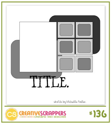
Winter Sketch #2

For today's sketch, I chose Creative Scrappers Sketch #136:


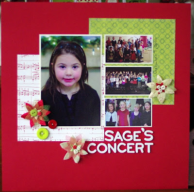
And here's what I made using it (& the January kit.)


If you'd like to play along with my Winter Sketches, just create a layout using one of the sketches I post. Post your layout in the MSS gallery and then link it to this thread in the forum. Your name will be entered into a draw to win a RAK from me.

Tuesday, January 4, 2011

happy new year!

happy new year! hoping all of you had a wonderful holiday and new year's. i certainly ate my share of turkey and shortbread!

popping in today to share some DT layouts with the january kit. i loved the bright colours in this kit. the crate snow day line was fun to work with and works well with non-holiday pictures too.

marcy's layout - i love how simple and elegant this page is. love the snowflakes (almost enough to want to run out and get a snowflake punch!), love the scribbles, and the subtle misting.

jen's layout - a totally cute picture of her new niece and i love how jen altered the month of the paper to suit the layout.

leigh's layout - are you sensing a theme here? i love how she used the b-side of the ki calendar paper and the topic of this layout! am thinking i would love to scrap about the same thing.

my layout - i loved that ki paper just too much to use it! i'm hoarding it for the perfect layout. anyway, this layout is a total opposite of my 'normal' style. i rarely ever cover an entire page with pp, but i seriously loved the combination of the crate snow days paper with the aqua b-side of their homeroom collection, and the sass polka dots.

for the rest of the DT layouts, click here. and check out the shoppe if you want to buy the kit. there's an online crop scheduled for this weekend, so it might be the perfect time to pick it up and break into those holiday pictures!