For this week's sketch, I chose Sketchabilities #44:
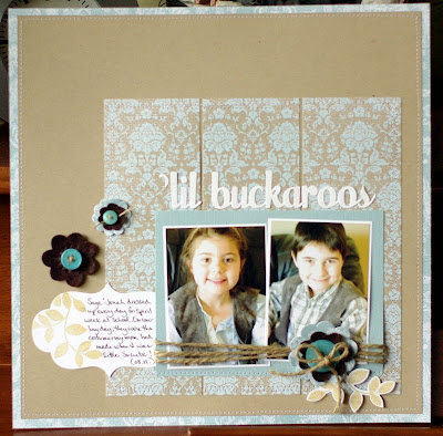
And here's the layout I made with it:
I changed this one up quite a bit, by flipping it, substituting my journaling diecut for a photo and moving the placement of the title. I'm pretty happy with how it turned out, though. Those new Crate Paper goodies that Marcy got in are super fun to play with!
If you'd like to play along with my Spring Sketches, just create a layout using one of the sketches I post. Post your layout in the MSS gallery and then link it to this thread in the forum. Your name will be entered into a draw to win a RAK from me at the end of Spring
Friday, April 29, 2011
Sunday, April 24, 2011
Featured Product Challenge
This month's featured product is something I'm sure you already have - border punches. It took me awhile to buy my first one - mainly because of the cost - but once I did I never looked back. I often use my Fiskars Threading Water punch on layouts already, so I challenged myself to use a different for this challenge. Of course, in the end, I still snuck in the Threading Water though ;)
Here's what the rest of the DT did:
If you want to play along, come and link your layouts in this thread.
Here's what the rest of the DT did:
If you want to play along, come and link your layouts in this thread.
Friday, April 22, 2011
Spring Sketch #6
For today's sketch, I chose the April Sketch on the Crate Paper blog:
And here's the layout I made with it:
I stuck pretty closely to the sketch on this one and used Bazzill cardstock and Crate Paper pp from the Shoppe.
If you'd like to play along with my Spring Sketches, just create a layout using one of the sketches I post. Post your layout in the MSS gallery and then link it to this thread in the forum. Your name will be entered into a draw to win a RAK from me at the end of Spring.
Tuesday, April 19, 2011
Photoshop Tutorial
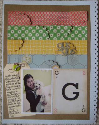
For my layout in this week's challenge, I scrapped a photo of me and Gus.
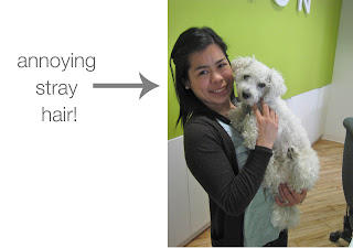
Problem is, in the original photo I had a piece of hair sticking out that drove me nuts. See?
So I took the photo into Photoshop Elements and within 5 minutes was able to get rid of the stray hair. Here's how:
1) Open photo.
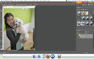
2) Select the 'clone stamp' tool in the toolbar.
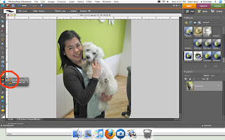
3. Choose an area of the photo that you want to 'clone' to cover up the item. In other words, for this picture, I wanted to clone the background. (If this makes no sense, hopefully these next few pictures will explain it.) Do this by putting your cursor over the area you want to clone and holding down ALT. Your circle should turn into a 'target' (basically a circle with a plus sign in it). Click once.
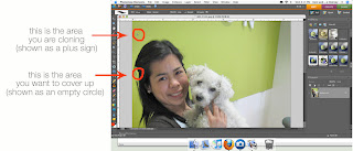
4) You'll notice that the area you want to clone is parallel to your targeted area - see how the plus sign is directly over the empty circle? When you choose an area to clone, keep this in mind. You'll want to choose an area that's relatively unobstructed. For example, if I was to drag my cursor down, you'll notice my cloned area move down as well. If I was to move my cursor too far down, it will start cloning my hair instead of the green wall behind me:
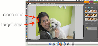
5. Now that you've selected your clone area, brush away to your heart's content by dragging your selected cursor over the item you want to cover up. I find it easier to zoom in on the area while doing this. If your circle is too big/not big enough, you can change the size at the top.
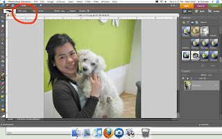
6) Voila! Annoying item gone.
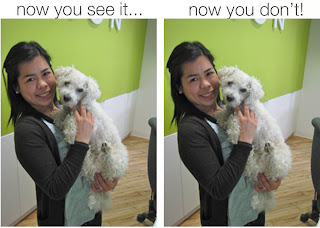
It takes some trial and error the first few times, but it's easy to get the hang of! Let me know if you have any questions by leaving a comment or sending me a PM.
oopsie!!!
sorry for the delay...
major monday brain farts happening yesterday..
but enough about that,
we have an inspiration challenge for you
this week. this month it was my turn to
give you something to inspire your imagination
and create..
i chose this image.
i love the colour and pattern and texture.
how will it inspire YOU??
this is what the design team came up with.
here is mine.
i love the busyness of everything going on.
so i went with that.
this is flo's.
i love the punched shapes pop-dotted on the
matching papers. awesome!
i love Leigh's circles!
its like a big tray of colourful cupcakes!
Okay!
now its your turn.
how will this image inspire you!
can't wait to see.
later!
Jen
Friday, April 15, 2011
Spring Sketch #5
This week's sketch is from a new sketch site called Stuck ?!. I chose their April 1st sketch:
And here's the layout I made with it:
I stuck really closely to the sketch this week, only making it smaller and using smaller pictures to include more white space on my page.
If you'd like to play along with my Spring Sketches, just create a layout using one of the sketches I post. Post your layout in the MSS gallery and then link it to this thread in the forum. Your name will be entered into a draw to win a RAK from me at the end of Spring.
Wednesday, April 13, 2011
Member Highlights
Just wanted to highlight some beautiful layouts that have caught my eye in the MSS gallery lately...
I'm loving grey right now and I noticed that all of the layouts I picked rocked the grey...
This one from Susi is just so pretty and I love those butterflies!
I love this layout from Tara. Did you notice the transparency background, that great photo (how fabulous is it that she has a picture of herself getting engaged?!) and the lovely little details.
Carla has a great monochromatic layout here. I love the pleated ribbon "banner" along the top! Very creative!
And Brookie rocked the homemade embellishments in her beautiful layout!
Thanks to all who post in the gallery-- your work is truly inspirational!
Monday, April 11, 2011
Triple Threat Challenge
Friday, April 8, 2011
Spring Sketch #4
I chose Sketch #68 from Inspired Blueprints for this week's sketch:
And here's the layout I made with it:
My daughter took some photos of my recently and when I spotted this one on my computer, I immediately came up with the title. My journaling was going to be a little different, initially, but I was challenged recently to do be "real" with my journaling, so this is what I came up with. I stuck pretty closely to the sketch, trading the banner for a row of flowers instead.
If you'd like to play along with my Spring Sketches, just create a layout using one of the sketches I post. Post your layout in the MSS gallery and then link it to this thread in the forum. Your name will be entered into a draw to win a RAK from me at the end of Spring.
Monday, April 4, 2011
Frame it!
Welcome to the Monday Challenge for April: Frame it!
Your challenge is to put a frame around it. Create your own frame(s) with your supplies, use products that were designed to be used as frames, create a piece of art and frame it for your home, etc.
Here's what the design team came up with for the challenge:
I had some Studio Calico frames in my stash that I wasn't quite sure what to do with. When I recently took out some of the Crate Paper paper and chipboard that I was hoarding, I thought mixing the two together would be the perfect solution.
And here's Flo's take on the challenge:
I love how she both framed the photo with that cool scalloped chipboard frame and her layout with strips of patterned paper. Very cool!
And here's a compilation of different framed projects that Jen has made:
If you decide to play along with this challenge, please post your layout in the gallery and then link it to the challenge forum-- we'd love to see what you create!
Friday, April 1, 2011
Spring Sketch #3
This week's sketch comes from the Crate Paper blog:
And here's the layout I made with it, using Crate Paper products, of course!
I actually strayed a little from the original sketch, adding a large photo where they had suggested a piece of patterned paper. I also added another photo and put the journaling on the opposite side. So, it looks a little different, but it was a great jumping off point to getting my creative juices flowing and that's what counts! ;)
If you'd like to play along with my Spring Sketches, just create a layout using one of the sketches I post. Post your layout in the MSS gallery and then link it to this thread in the forum. Your name will be entered into a draw to win a RAK from me at the end of Spring.
And if you're looking for more challenges to get you in the scrappy mood this weekend, make sure you check out the weekend online crop we're having in the forum.
Subscribe to:
Posts (Atom)