Monday, March 28, 2011

Featured Product Challenge

This week's challenge is a Feature Product Challenge, where we'll choose a specific product for you to use on your layout. I was pretty excited to work with this month's product as I pretty much use them on every layout anyway. Here's my growing collection:
Figured it out? Yep, this month we're challenging you to break out those mists! For the most part, I use my mists pretty simply - I stick my paper in a box, and mist away. I never understood how people got those perfect splotches of mist on their layouts, until Marcy posted this tutorial on her blog. Duh! But I've never really tried using mists to mask, like these layouts:


Perhaps that's what I should have done with this challenge, actually. Oh well. Anyway, here's what the DT came up with.

My layout. In case you can't see, I misted the cardstock with Studio Calico White Mister Huey, and I also misted each of the shipping tags a different colour - Pink Maya Mist, Sunshine Maya Mist and Lunchtray Mister Huey.

If I'm correct, Leigh used something other than conventional mists for her layout. You'll have to ask her how she did it though :)
Jen's layout - her blue misting gives that awesome pop of colour against the pink pp.

Come play along with us! Be sure to link your layouts to this thread if you have!

Friday, March 25, 2011

Spring Sketch #2

This week's sketch comes from Davinie Fiero's blog:


I chose to do a layout about a member of my family who doesn't feature in my albums very much, unfortunately.... my husband, Cameron:


I stuck pretty closely to the sketch, but used only three photos instead of four. I used Crate Paper patterned paper and border stickers, Pink Paislee & Cosmo Cricket chipboard letters & a star pin all from the Shoppe. The chipboard rectangle and brad at the bottom of my page are My Mind's Eye.

If you'd like to play along with my Spring Sketches, just create a layout using one of the sketches I post. Post your layout in the MSS gallery and then link it to this thread in the forum. Your name will be entered into a draw to win a RAK from me at the end of Spring.

Wednesday, March 23, 2011

An inking tutorial

Hey there, Leigh here, with a little tutorial on using ink to change the colour of patterned paper.

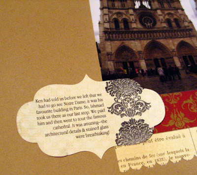
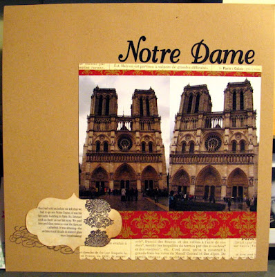
A few weeks ago, I was working on my Paris Album, for which I used primarily MME Lost & Found patterned paper and kraft cardstock. I was trying to incorporate some scraps for my journaling, so I cut a tag out with my Cuttlebug (using my Tim Holtz Styled Labels die) from a piece of Pink Paislee patterned paper. I printed my journaling onto the tag and added a stamped image.

However, when I added it to my layout, I thought that the journaling tag was a litte too "white" and didn't seem to go well with the other papers.


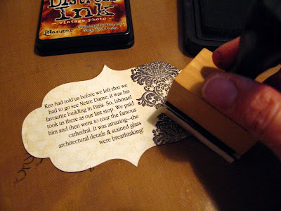
So, I took my Ranger craft sheet, my Ranger blending tool and my Tim Holtz Distress Ink in Vintage Photo.


I placed the tag on my craft sheet and inked up the blending tool. Then, using a circular motion (& starting on the craft sheet and moving towards the tag), I blended the ink onto the tag, working my way all around it.


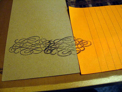
I also thought the tag looked a little plain on its own, so I decided to add some stamped swirls behind it. I masked off the patterned paper that was on the layout using a post it note and stamped my image a couple of times. (You'll noticed I flubbed a little-- a common occurence when I stamp!-- but I was covering that part with the tag, so I decided not to worry about it.)


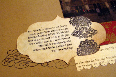
Then I removed the post-it note and added the tag.


And here's the completed layout:


Thanks for looking!

Monday, March 21, 2011

its that time again!!!

time for another challenge!!

have you liked the challenges so far??
We've been trying to keep them fresh
and exciting, and today is no different.

this week is an inspiration challenge.
one design team member will pick either
an item, a photo, a colour....whatever
inspired us some way..this week Marcy
has given us a photo to play with. there
is so many ways to interpret this
photo... i can't wait to see how you
see inspiration in it!


I was inspired by the colour combo, and the
script on the headboard.


Flo's fab layout!


Leigh's lovely layout!


We must be craving spring!
we all used butterflies!! lol

how are you inspired by the photo??
share your project in the gallery!!
we want to see!!!


later!
Jen

Friday, March 18, 2011

Spring Sketch #1

I realize that I'm a couple of days early for the official first day of Spring, but I'm so eager to be done with Winter, that I'm posting the first spring sketch today.

And here it is, a sketch from Pencil Lines (it was a sketch for their recent DT call):


And here's the layout I made with it:


I stuck pretty closely to the sketch, but just couldn't bring myself to put the photo on a angle like that! LOL! I also moved the title lower and changed up the placement of my embellishments a little.

If you'd like to play along with my Spring Sketches, just create a layout using one of the sketches I post. Post your layout in the MSS gallery and then link it to this thread in the forum. Your name will be entered into a draw to win a RAK from me.

*And a reminder to anyone who made a layout using a Winter sketch, you have until midnight, tomorrow (Saturday, March 19th) to link it to the Winter sketches thread in the forum to be eligible for the draw for a prize.

Wednesday, March 16, 2011

Member Spotlight

There are always a number of projects in the gallery that catch the DT's eye at any given point. So we've created a new blog segment called 'Member Spotlight' to show off some of those great creations!

To be honest, I think I was supposed to highlight just one project, but I had such a hard time narrowing it down, I chose to show a few. :)
I love how Carla chose to scrap the thank you cards from her wedding. What a great way to keep that memory! And the fall colours she chose match her wedding theme (from what I can see) perfectly!
This layout from Tara just makes me so happy. I love this Crate line, and how she used that string of lights across the top.

Oh, Carol. She is the queen of MCC and thrift store finds. It amazes me what she creates out of her amazing finds. For instance, this project only cost $10! If you look through her gallery you'll see it's full of projects like this.

Keep posting to the gallery and who knows? You may find your creations highlighted here someday!

Sunday, March 13, 2011

monday, monday

did you survive the blizzard?
gosh - that was something.
the last thing i wanted to see
was more snow.

well, to get your mind off of
all the white stuff outside,
i have another challenge for you.

this weeks challenge is a
TRIPLE THREAT!!
what's that you ask?
well the design team each choose
a random "something" to use on a
layout...

this weeks triple threat includes:

~ hearts
~ felt
~ a border punch.

this is what i came up with,


my design team-mates have also
created a layout for this challenge!
so scoot over to the gallery and check it
out!!

have a great week!
Jen

Friday, March 11, 2011

Winter Sketch #11

This week's sketch comes from the My Mind's Eye blog. It's their challenge #21 sketch:


And here's the layout I made with it, using MME products, of course.


I stuck really closely to the sketch this time, although I did use rectangular photos instead of square.

If you'd like to play along with my Winter Sketches, just create a layout using one of the sketches I post. Post your layout in the MSS gallery and then link it to this thread in the forum before midnight on March 19th (the last day of Winter). Your name will be entered into a draw to win a RAK from me, which I'll draw for on March 20th.

Wednesday, March 9, 2011

Right Now I Love

Welcome to another new blog segment called "Right Now I Love....". Each month, one of the DTs will highlight a product, technique, etc. that they're loving and share it with you.

In the January kit, Marcy included a sheet of the diecut ki calendar paper. At the time, I loved it too much to even use it! Finally this week, I decided to stop hoarding it and put it to use. At first I really wanted to use it and showcase the days of the week - maybe use it as a way to document a 'Week in the Life' pictures, or something along those lines, like seen in these layouts:

Susan Weinroth

Kelly Purkey

But because I can never stick with those sorts of things, I knew that would never work for me.
So instead I decided to cover up the days of the week using some fabric and just use it as regular 'cardstock'. I love that the calendar boxes act as grid lines and help contain all the small pieces of pp, which would otherwise be left floating.

I think there's still more calendar papers in the shoppe, in different shapes and colours. I know I'll definitely have to get my hands on more the next time I'm there! Have you used these papers? I'd love to see what you did with them! Leave a comment and show me your layouts!

Monday, March 7, 2011

Hello!!!
how was your weekend?
did you get any layouts created at the
online crop?

well, if you didn't i have another challenge
for you! the design team has been working on
some new challenges especially for you!

these challenges will be of any variety!!
you'll just have to check on mondays for a
fresh new challenge!

so without further adieu,
our challenge this week is to use a number
for the title of your next layout.

...the next layouts are the ones the
design team came up with!

Leigh's


Flo's


and mine


if you like the challenge,
then post your layout in the gallery!!
we'd love to give you some love!!
later,
Jen

Friday, March 4, 2011

Winter Sketch #10

For this week's sketch, I chose one from the March Page Maps:


And here's the layout I made with it, sticking pretty closely to the orginal, but using three photos instead of four.


If you'd like to play along with my Winter Sketches, just create a layout using one of the sketches I post. Post your layout in the MSS gallery and then link it to this thread in the forum. Your name will be entered into a draw to win a RAK from me.

And be sure to check out the challenges posted for this weekend's online crop here.

Wednesday, March 2, 2011

New product highlight: Good Day Sunshine

Even though it's cold outside, I always think this time of year is exciting-- scrapbooking-wise-- because it's when Marcy starts to get in the new CHA-winter product in the Shoppe.

I was so thrilled with the new My Mind's Eye releases this year. So, of course, I had to pick up some of their Good Day Sunshine patterned paper that Marcy got in recently. Isn't it adorable?


I love the colours & designs and think it would work well for either boy or girl layouts.

Here's one layout I made with it (so far!):


For this layout, I pretty much just used the three sheets of patterned paper and a Bo Bunny brad. The reddish background paper (the border) is also MME, but from an earlier line, that I had in my stash. I was pleased how well they went together.